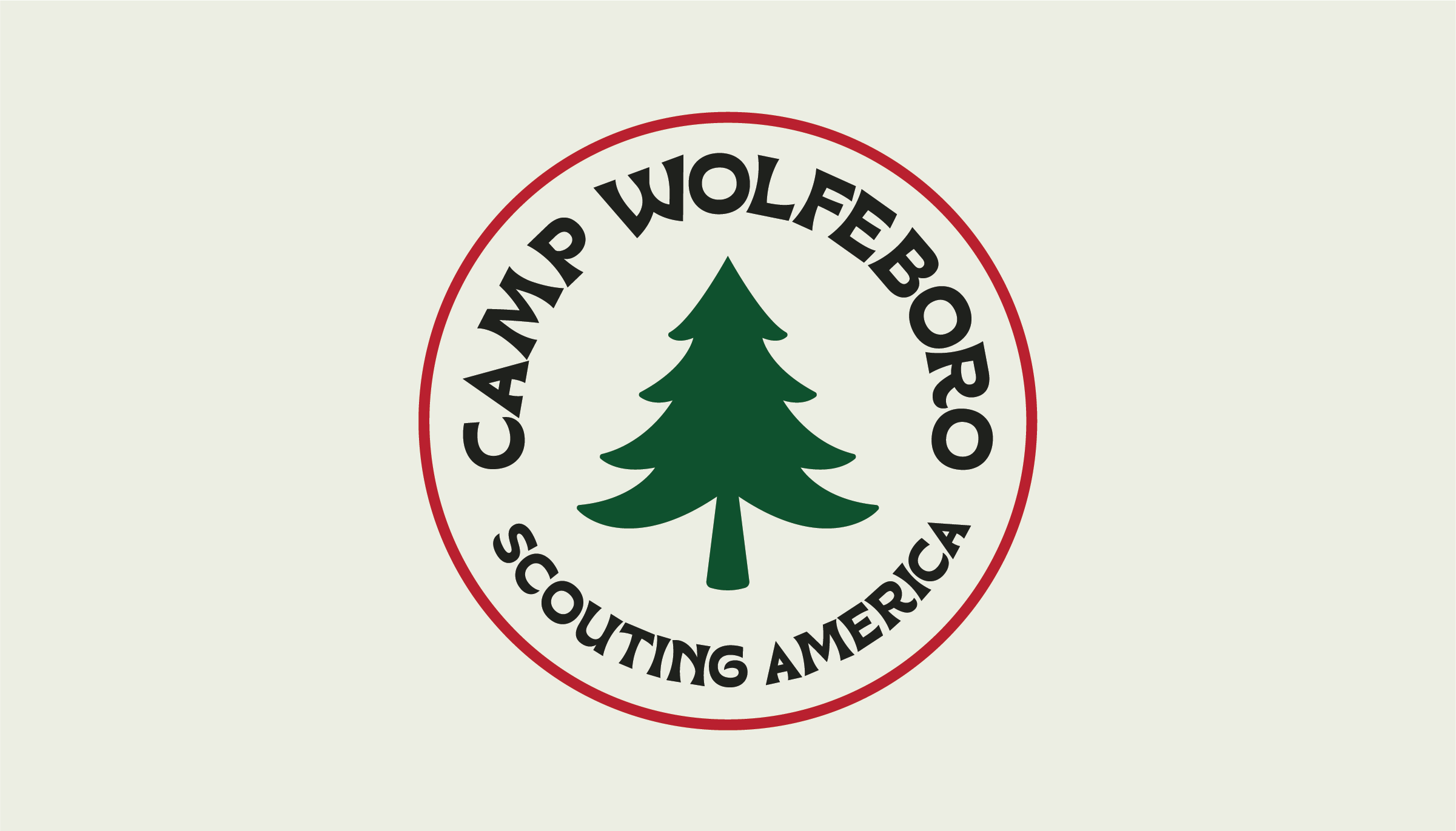
Camp Wolfeboro’s rebrand was created ahead of the camp’s 100th anniversary, refreshing a legacy that began in 1928 through a visual system inspired by vintage Scouting design. Drawing from retro outdoor illustrations, vintage Scouting insignia, and colorful mid-century camp graphics, the identity was designed to feel nostalgic, adventurous, and timeless.
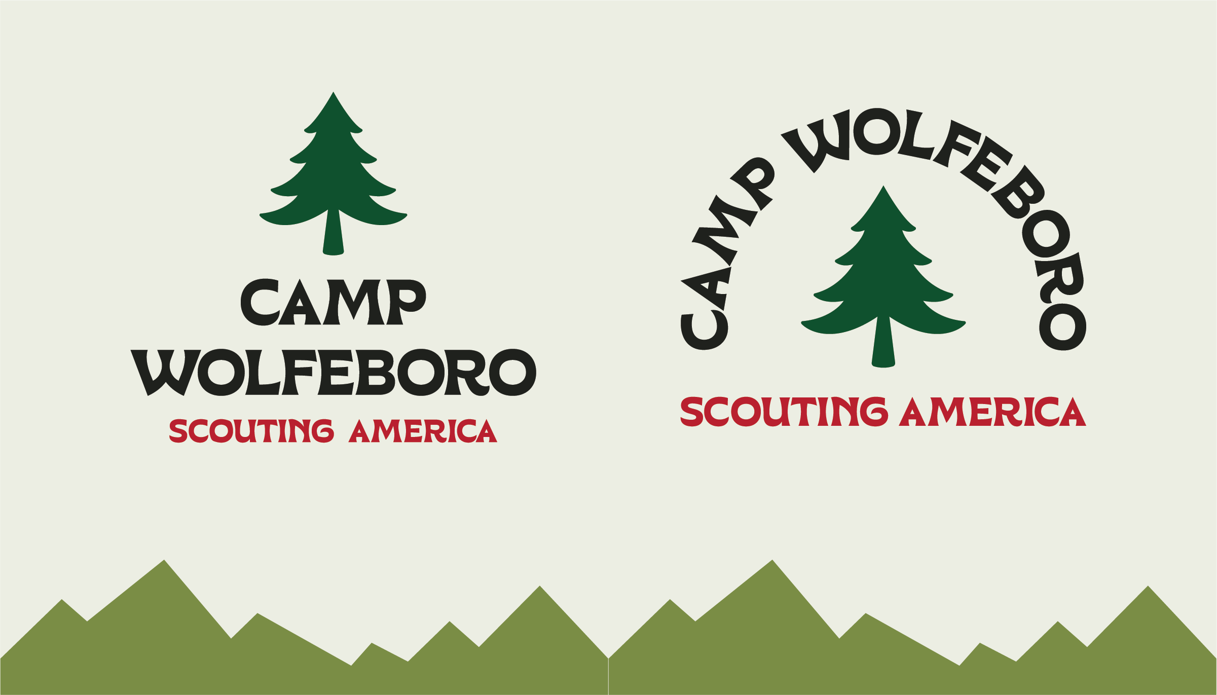
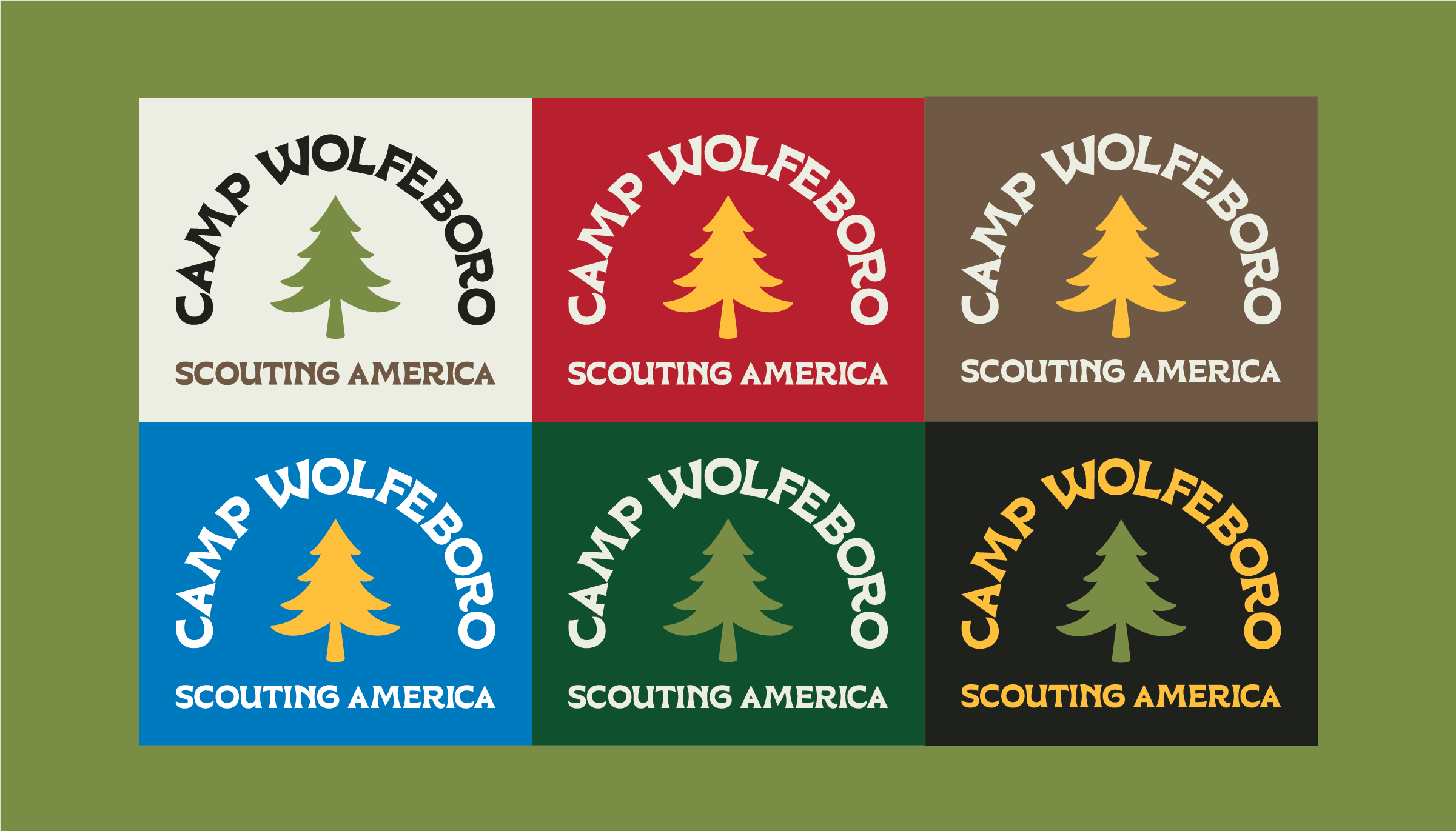
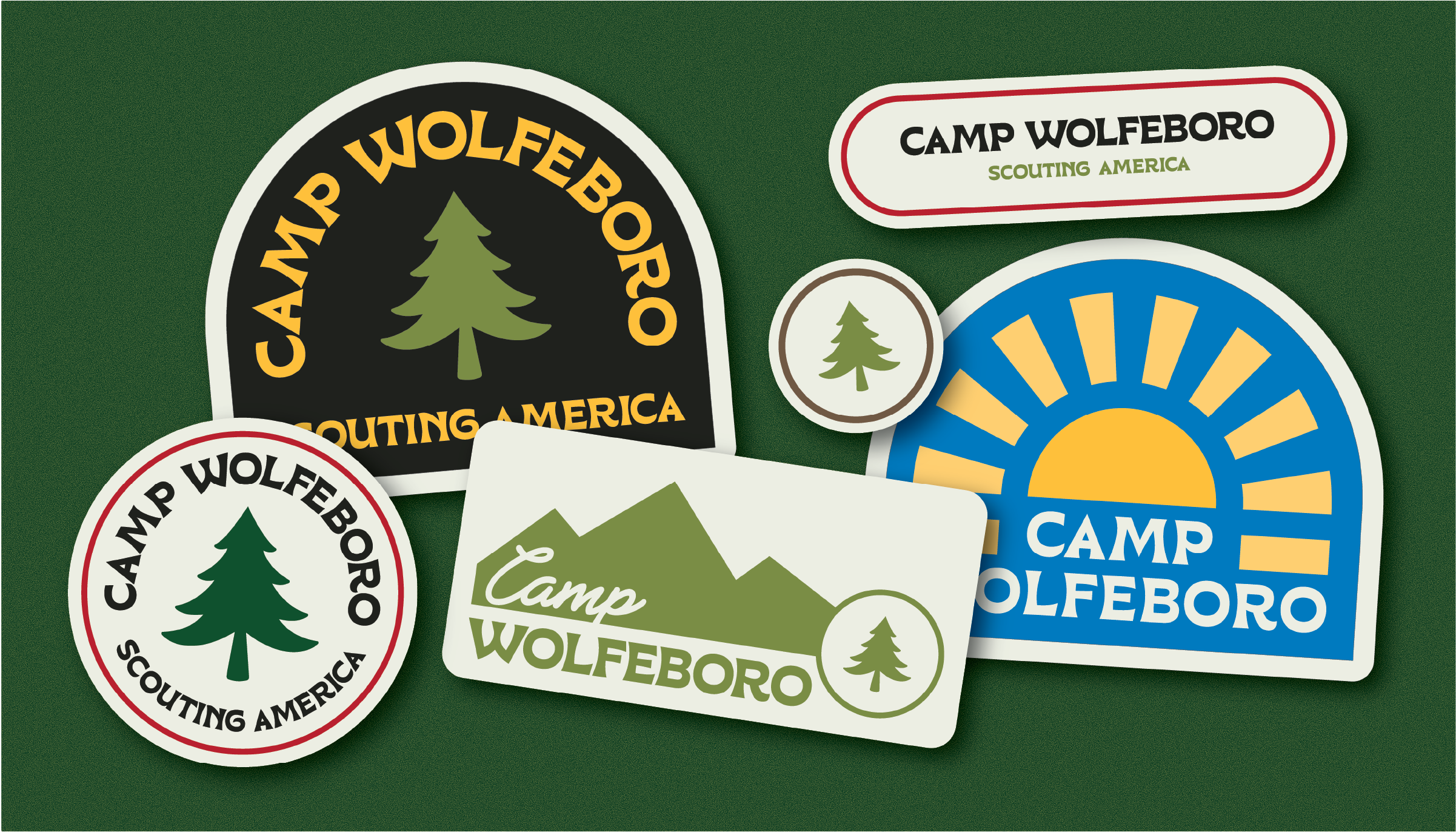
The priority of this project was building a flexible brand system that could live across patches, stickers, shirts, letterheads, and a wide range of camp materials. The iconic pine tree motif was updated based on historic iterations and paired with a playful typeface. Bold color, classic typography, and consistent illustrated details bring renewed energy to the brand.
The result is an identity that honors Camp Wolfeboro’s history while giving it a stronger, more cohesive presence for its next chapter that feels equally at home on official stationery, commemorative merchandise, and future centennial celebrations.