<  Back
Cherry Cherry Skincare
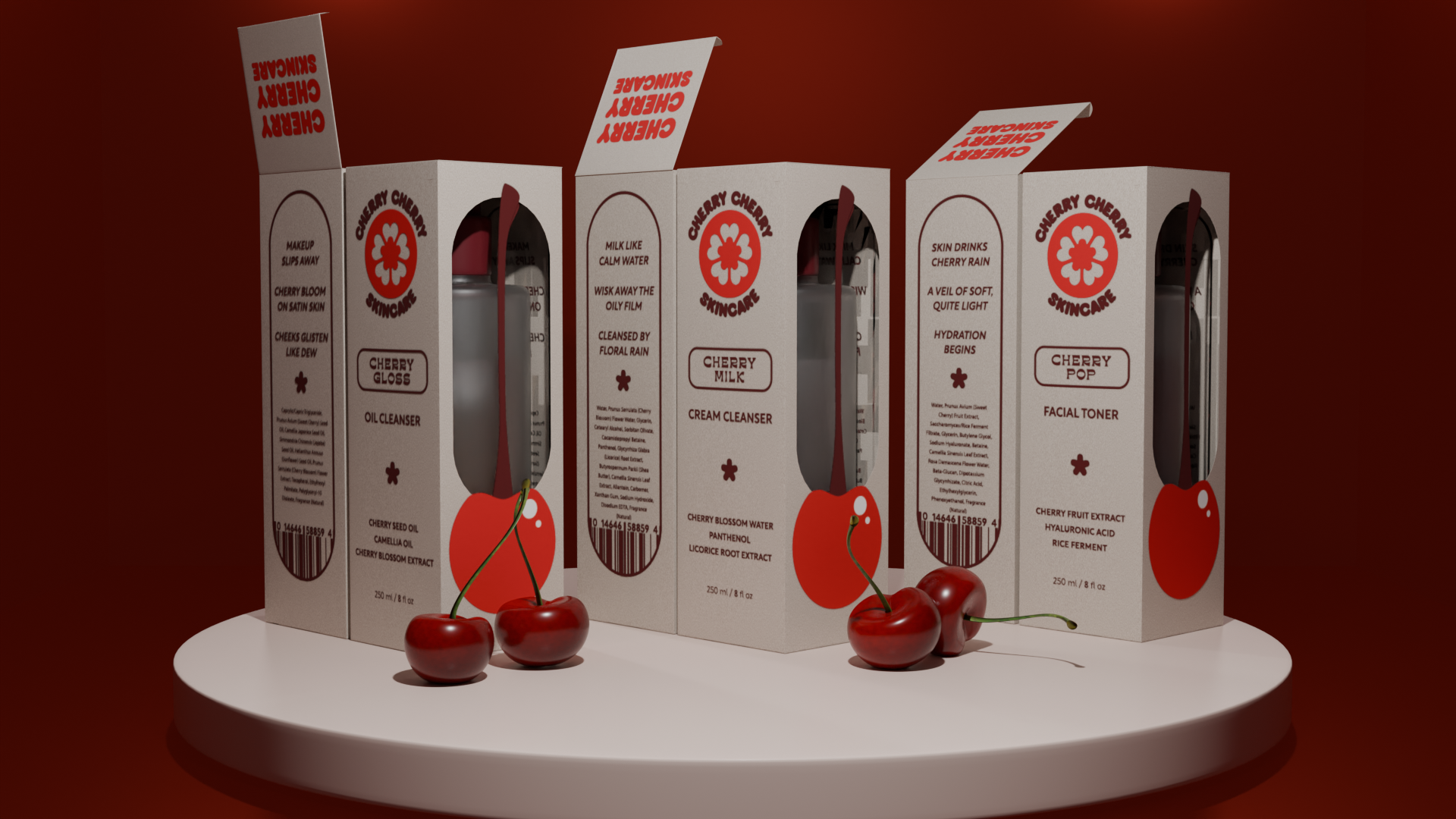
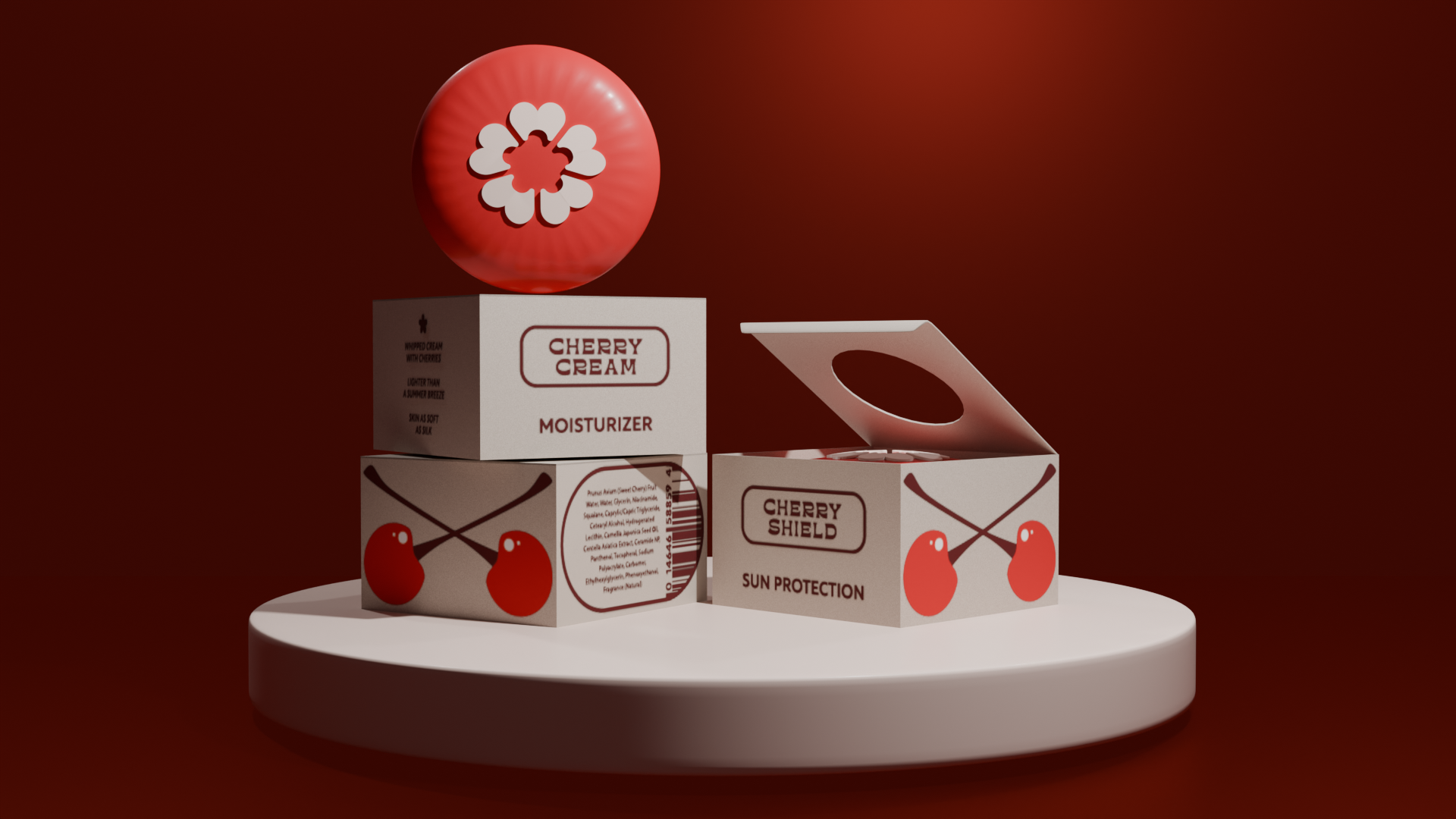
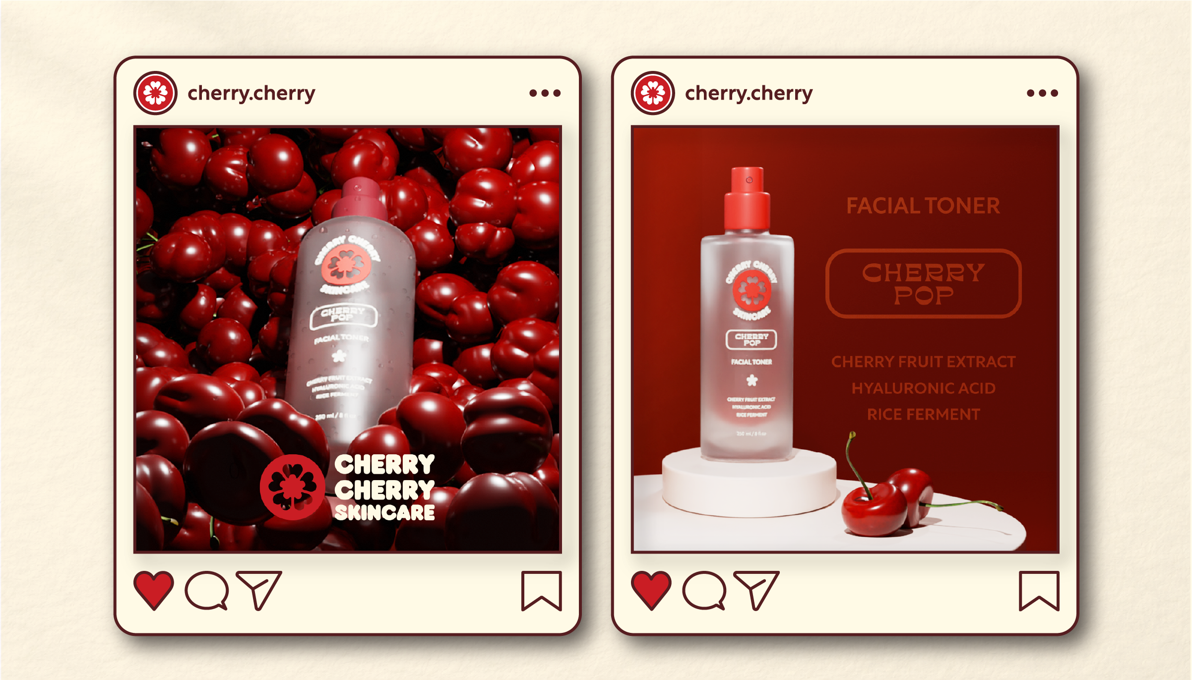
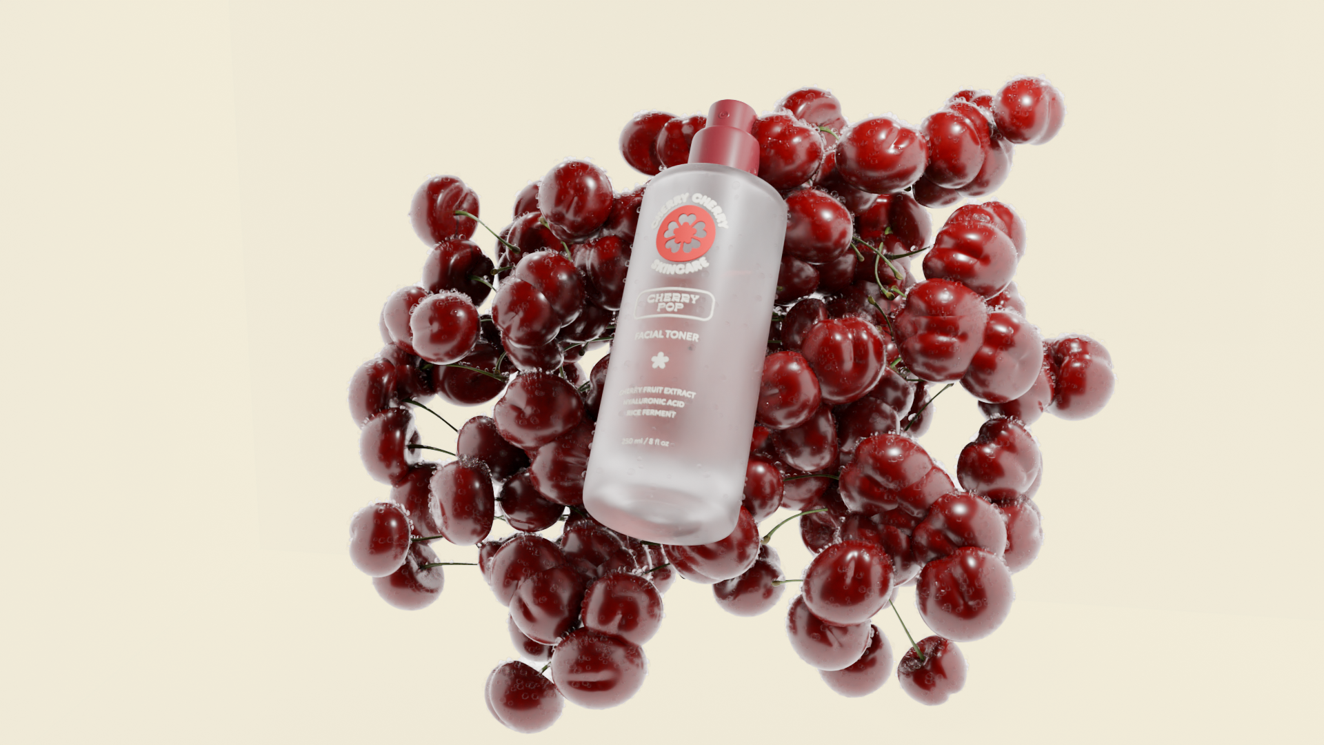
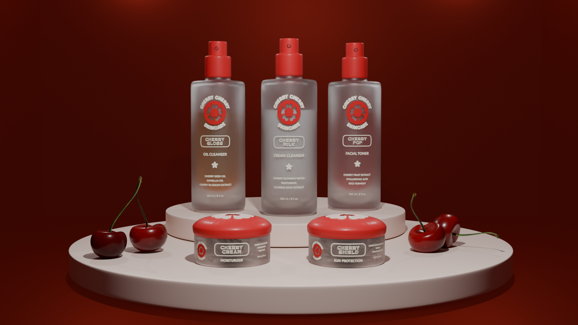
Cherry Cherry Skincare is a conceptual skincare brand developed to showcase the relationship between packaging, product rendering, and visual marketing. Inspired by Japanese Skincare and conceptual simplification of wabi-sabi style, the project uses frosted materials, cherry-red accents, and rounded typography to create a playful yet refined beauty identity.

This project was primarily focused on artistic direction and 3D modeling for products. The use of defined creative direction, and unique packaging show the strength in a strong brand identity through simple assets.

The final system extends across product packaging, campaign imagery, and social media applications, presenting the brand as a full visual experience rather than a standalone package design.
Cherry Cherry Skincare logo with a red circular flower symbol on the left and bold brown text on the right.Three Cherry Cherry Skincare product boxes labeled Cherry Gloss oil cleanser, Cherry Milk cream cleanser, and Cherry Pop facial toner, displayed with fresh cherries on a white circular platform.Cherry-themed skincare products including a moisturizer and sun protection cream displayed on a white round platform against a dark red background.Two social media style posts featuring Cherry Cherry Skincare's Cherry Pop facial toner with cherry fruit extract, hyaluronic acid, and rice ferment.Facial toner bottle labeled Cherry Pop surrounded by fresh red cherries with water droplets on a light background.Five Cherry Cherry Skincare products including Cherry Gloss oil cleanser, Cherry Milk cream cleanser, Cherry Pop facial toner, Cherry Cream moisturizer, and Cherry Shield sun protection on round white platforms with cherries around them.